How to format website images the best way for all devices
Choose the right quality, file size and dimensions
Make your images the right way for desktop, tablet & mobile
Check out my new version of this guide on formatting photos for web use here
(THIS POST IS OLD AND HAS BEEN SUPERSEDED: THIS WAS LAST UPDATED Feb 2023 - please visit the new version of this blog post here)
If you have a website, you really should be thinking about the size and quality of your images, especially these days. With more and more high-resolution devices such as Mac products with Retina screens, and with broadband getting faster and cheaper, websites are using larger and larger images. However, at the same time, more users are accessing the web through mobile devices or in remote/developing countries with bad internet connection, so we must also consider the file size of our images.
As I earned a degree in Fine Art Photography and worked as a professional photographer for several years, I reckon I've got a pretty good eye, so I'm writing this post to help anyone who puts images onto websites find the ideal balance of image quality and file size. I'll also let you know the best number of pixels to use for a range of purposes online.
The right file type = JPG (most of the time)
This one is easy: 90% of the time, you want to be using JPEG. JPEG is the right file type to use for any type of imagery that has gradients or shading - in other words, all photographs should be saved as .JPG, as should most illustrations. The only time I ever recommend using PNG* is for illustrations or icons that have flat, solid colour - no shadows or any other type of shading - and/or if you need a transparent background. And you really want to avoid GIF unless you are using an animated GIF (and watch out for the file size if you are!).
* Some website systems will allow the newer SVG format, but that’s really geared towards designers & tech people, so not covered in this post.
The right dimensions / number of pixels to use
Now, you'll want to ensure your images are the right number of pixels. Too large, and the files will be massive, too small and your high-res visitors will see fuzzy pictures on their HD Retina screens. Retina screens show twice as many pixels in the same size space, so the days of 72dpi (dots per inch) are limited. These days, many users will see 144 dots or pixels per inch on their screens.
Most website management systems such as Squarespace and WordPress automatically serve up the 2x resolution images to HD viewers, so if your website is built in one of these, then you don't need to worry about anything other than ensuring that you always use images that are 2x the number of pixels of the space. Without getting into too much detail, I can suggest the following rules of thumb*:
FULL SCREEN: 2000 - 2500* pixels wide for images that will fill the screen, such as banner images or full-screen backgrounds (also for products if you have zoom functionality enabled)
LARGE: 1500 - 2500* pixels wide for images that will fill the width of the content area on most websites
MEDIUM: 1000 or 1500* pixels wide for images that will appear at 1/2 to full width of the content area
SMALL: 750* pixels wide for images that will only ever be shown at sizes up to 1/4 of the content area width
TINY: 500* pixels wide for images that will only ever be shown at very small proportions of the content area width
* NOTE: These numbers correspond to the sizes that the Squarespace system creates. Squarespace creates multiple versions of the images you upload, and serves the closest corresponding size depending on where you put the image in the page, and the type of device the viewer is using. Please bear in mind that having lots of images on a page can make the page load slowly, so there may be instances when you need to step down a size to compromise load time vs image quality (see below for more detail).
Note: Always use images with an EVEN number of pixels. Why? Because some website platforms such as Squarespace use automated software to reduce the image size based on the screen size. And if your original image is an odd number of pixels, the software calculations can mean that the size needed does not divide evenly. This can make images appear fuzzy.
The above numbers will ensure your HD visitors will have a high quality viewing experience. The 'content area' on most web sites on a computer screen is usually around 1400 pixels wide as of January 2022 - though it's getting larger as HD monitors and web TVs grow. In future, this number will most certainly change. Here's a handy illustration to help - the content area is the part of the main body below the top banner image where all of the text and images fit:

The right file size = less than 1MB, ideally 500k or less
The size of your file is determined by the overall number of pixels, combined with the amount of compression that has been applied. We'll cover compression below, but as a general rule, even if you don't use compression, you never want to be uploading files larger than 1MB - and ideally, your images should be a lot smaller than that (max 500k is a good target - the smaller the better!).
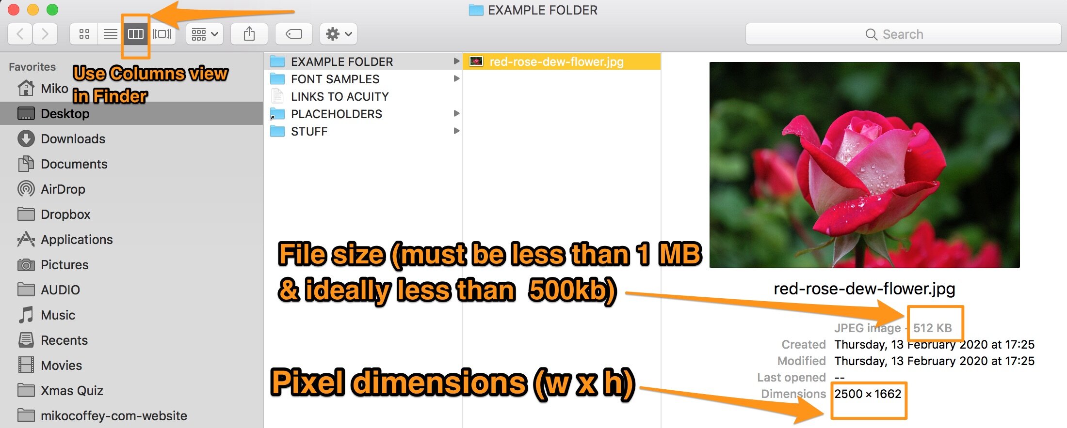
The screenshot here shows how you can see the file size and pixel dimensions on a Mac. Click here to find out how on a Windows PC >
Lots of large files/images = bad SEO / user experience
Every image you use will add to the page load time, so if you have lots of images or even just a few large images you may end up with a page that loads SLOWLY. Not only is this bad for your site visitors, but Google also uses page load speed as one of the many factors that determine your search engine rank. Don’t get super hung up on this, as it’s only one of the factors, but do be sensible and try to keep your load times as low as possible.
If your website will have gallery pages, try to keep each gallery to a max of 30 images if possible. And if your website uses several full-width banner images on a single page, you may need to step down to 2000 or 1500 pixels wide even though it’s a banner image, because it’s better to compromise a little bit on sharpness/image quality for your HD viewers than to create a slow-loading page.
The right % quality to export = 60% ish
Most of the time, if you are using stock images, free images from the great resources like pexels.com or your own images from a photographer or your camera, then your original images will be uncompressed. In order to make them web-friendly, you should compress them when you export them from your image viewing software such as Mac Preview, Photoshop, Lightroom, Windows Paint or Live Gallery - usually you do this by dragging a slider or specifying a % quality when you export. Compressing the image means to reduce the file size, but there will be a loss of quality whenever you compress. The art of compression is to minimise file size without noticeably affecting the image quality too much.
There are also specialist tools that have been created to help reduce file sizes of images. These are called image compression tools, and they normally work by reducing the file size of an image to a size that’s smaller than standard image tools can, without visibly affecting the image quality.
UPDATE: I now no longer call JPEGmini my favourite compression tool, as they have changed their tool. Full explanation coming in another blog post soon, but for now just know that I now use Shortpixel instead. Check out Shortpixel here >

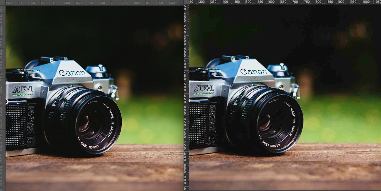
Every software application has a slightly different method of compressing images. As I'm a Mac user, I am comparing Photoshop vs Preview on their own, and then with JPEGmini (my former compression tool) applied to each. Here's a chart showing file size at the different quality export settings when applied to a 1500 x 1000 pixel image.
You can see that JPEGmini really makes a massive difference on very high quality images. JPEGmini stops working at quality of 60% or so. And Preview won't let you export at anything lower than 20% (if you're a Preview user, note that the lines on the slider mark 20-100% in 10% increments).
As a general rule, I recommend the following % quality for images:
65-70% quality export (then run JPEGmini or ShortPixel compression) if you are a photographer or creative business and need stunning images
50-60% quality export (then run JPEGmini or ShortPixel compression) for normal purposes at larger sizes
40-45% quality export (then run JPEGmini or ShortPixel compression) if you are using images at small sizes, or if your website visitors are on slow internet connections
You can actually get away with even lower quality in certain circumstances. I've made a page showing this, so click the button below to see this in action.
See some real life examples
These are just guidelines, but I hope they will help you when preparing your images for use online. If you want to see side-by-side comparisons of the different images head on over to my Squarespace portfolio site now:
When you click you'll land on a page that shows different compressions and compares JPEGmini to standard images, for the real eagle eyes out there (like me!)
BONUS TIP: The right filenames = contain your brand and keywords
Your image files are probably named something like this:
IMG_2458.jpg
If you add this to your website with this filename, you are accidentally search-engine-optimising your website for the term “IMG_2458”. That’s a wasted opportunity for SEO! You should name your files with your brand name and some keywords and/or identifier of what’s in the image, each separated by HYPHENS (if possible, vary the keywords). Just don’t overdo it on the keywords, and don’t expect to rank number 1 on Google simply by changing your filenames. SE-optimised filenames are not going to rocket you to the top, but every little bit adds up. Here’s a much better name for an image file:
italy-holiday-home-belvedere-farmhouse-kitchen.jpg
Happy uploading!